I meant to share this a while ago, but hey, better late than never.
In finance, it’s common to hear statistics like “average household income is X” or “the average salary in America is Y” being used. But the average is often not very useful, and here’s (one of) the reasons why:
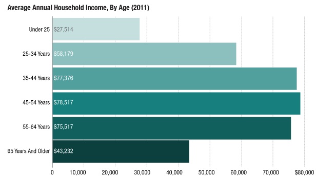
Photo Credit: NPR
This is a bar graph of average household incomes in America, grouped by age. Someone starting out their career might be discouraged to see/hear on CNN that average household incomes are $50,000 a year… until you look at a graph like this. When incomes are broken down by age group, the real pattern emerges: Different age groups at different points in their careers earn different amounts of money, on average. And when you collapse all this information into a single average value, higher earning cohorts, such as the 45-54 age group, pull the average higher.
I like seeing statistics broken down like this because it’s easy to see how the overall average doesn’t always reveal underlying patterns. Sometimes, more detail is required because a single number doesn’t accurately represent the data.
Of course, earning more is better and I’m not saying that anyone should be happy or not happy making X amount of money. But it’s important to not be overly sensitive to statistics that blithely declare that an average is XYZ without digging a little deeper.
This blog was inspired by this article on NPR.